CSS Grid Columns, Rows and Gaps
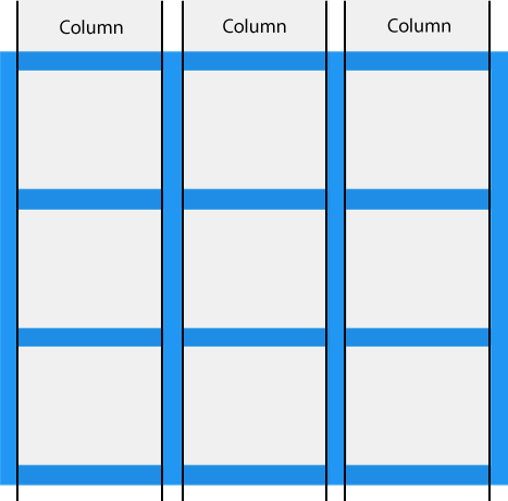
Grid Columns
The vertical lines of grid items are called columns.
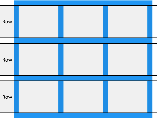
Grid Rows
The horizontal lines of grid items are called rows.
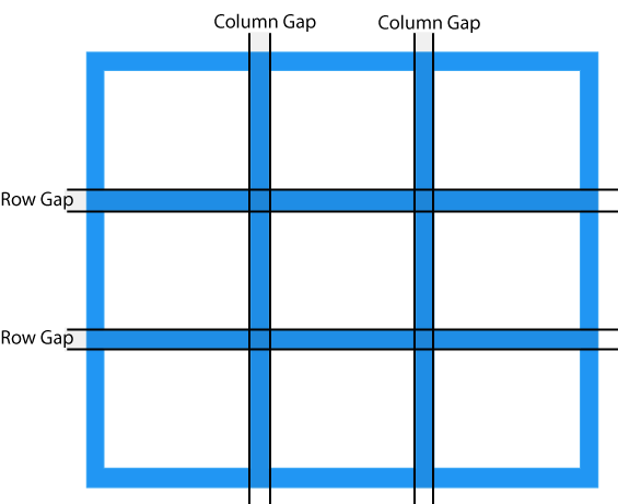
Grid Gaps
The spaces between each column/row are called gaps.
You can adjust the gap size by using one of the following properties:
column-gaprow-gapgap
The column-gap Property
The column-gap property specifies the gap
between the columns in a grid.
Example
Specify a 50 pixels gap between the columns in the grid:
.container {
display: grid;
column-gap: 50px;
}
Result:
The row-gap Property
The row-gap property specifies the gap
between the rows in a grid.
Example
Specify a 50 pixels gap between the rows in the grid:
.container {
display: grid;
row-gap: 50px;
}
Result:
The gap Property
The gap property is a shorthand property for
row-gap and
column-gap:
Example
Set the gap between rows to 50px, and the gap between columns to 100px in the grid:
.container {
display: grid;
gap: 50px 100px;
}
Result:
Example
Set the gap between rows and the columns to 50px in the grid:
.container {
display: grid;
gap: 50px;
}
Result:
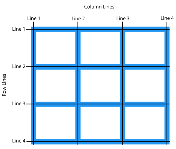
Grid Lines
The lines between columns are called column lines.
The lines between rows are called row lines.
We can specify where to start and end a grid item by using the following properties:
grid-column-startgrid-column-endgrid-row-startgrid-row-endgrid-columngrid-row
You can refer to line numbers when placing a grid item in a grid container.
The grid-column-start and grid-column-end Properties
The grid-column-start property specifies where to start
a grid item.
The grid-column-end property specifies where to
end a grid item.
Example
Place the first grid item at column-line 1, and let it end on column-line 3:
.item1 {
grid-column-start: 1;
grid-column-end: 3;
}
Result:
The grid-column Property
The grid-column property is a shorthand property for the grid-column-start and the grid-column-end properties.
Example
Place the first grid item at column-line 1, and let it span 2 columns:
.item1 {
grid-column: 1 / span
2;
}
Result:
The grid-row-start and grid-row-end Property
The grid-row-start property specifies where to start
a grid item.
The grid-row-end property specifies where to
end a grid item.
Example
Place the first grid item at row line 1, and let it end on row line 3:
.item1 {
grid-row-start: 1;
grid-row-end: 3;
}
Result:
The grid-row Property
The grid-row property is a shorthand property for the grid-row-start and the grid-row-end properties.
Example
Place the first grid item at row-line 1, and let it span 2 rows:
.item1 {
grid-row: 1 / span 2;
}
Result:
All CSS Grid Column, Row and Gap Properties
| Property | Description |
|---|---|
| display | Specifies the display behavior (the type of rendering box) of an element |
| column-gap | Specifies the gap between the columns |
| gap | A shorthand property for the row-gap and the column-gap properties |
| grid-column | A shorthand property for the grid-column-start and the grid-column-end properties |
| grid-column-end | Specifies where to end the grid item |
| grid-column-start | Specifies where to start the grid item |
| grid-row | A shorthand property for the grid-row-start and the grid-row-end properties |
| grid-row-end | Specifies where to end the grid item |
| grid-row-start | Specifies where to start the grid item |
| row-gap | Specifies the gap between the grid rows |